User-Interface Guidelines
Background
This document is written with the goal of highlighting and detail the wants and needs of the customer for the application to adequately perform as expected. This also servers to let the frontend developer of the application have a clear idea of what the vision is and what should be implemented.
General principles
This is not a specific design of a page layout, but rather a description of how the different elements are designed – the principles of design, if you will. Although an actual detailed design exist, this serves to help navigate if deviations, changes or additions should occur. In those cases this document can be used a base for creating or changing components. The frontend solution will be referred to as the app during the rest of this document.
Main navigation
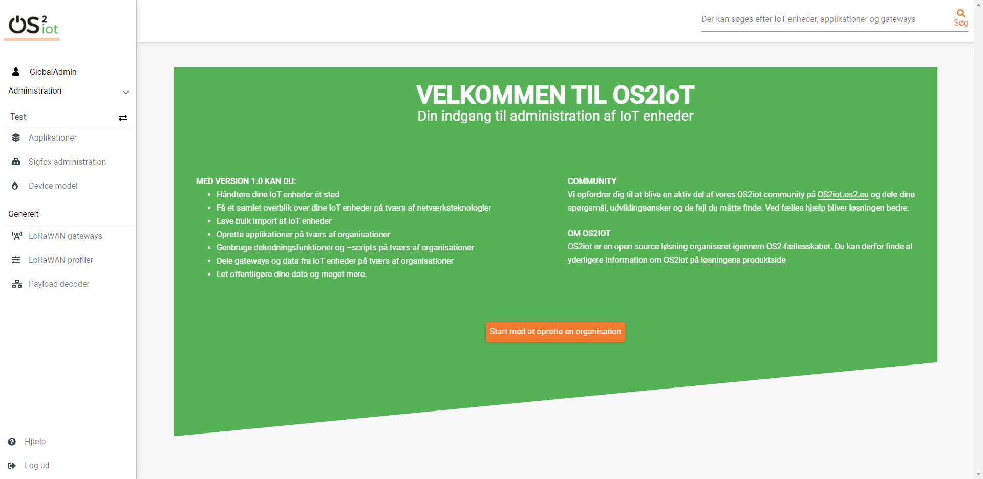
The app will have a main navigation menu in the left column. This is solely used to switch between the different main pages of the app.
The Dashboard page will be the landing page of the app. On the top left the logo functions as a home button. The top header will contain a search input field stretching thereby removing it from the navigation menu where it is displayed in the image below.
Use of keyboard
No shortcuts have been defined for the app.
The tab order will be from top to bottom and left to right in a columnal fashion for all interactive elements . See the below image for further details.
No right-click or double-click functions in this solution.
Ease of Use & Accessibility
WCAG AA
OS2IoT is partially designed based on current user-friendliness standards, as defined in:
W3C standards see https://www.w3.org
The guidelines in WCAG 2.1 Level AA, see http://www.w3.org/TR/WCAG21/.
Although, OS2IoT is an internal system used within the organization and therefore is not WCAG Compliant. But as Web Content Accessibility Guidelines (WCAG) 2.1 includes a wide range of recommendations on how to make web content widely available, there have been some considerations regarding user friendliness, and partly because:
Following these guidelines can ensure accessibility for a larger group of people with disabilities, including the blind and partially sighted, deaf and hard of hearing, people with learning disabilities, cognitive limitations, limited mobility, speech impairment and photosensitivity, and people with combinations thereof.
Following these guidelines will also often make web content more user-friendly in general.
And in order to provide the necessary degree of accessibility that commits Erhvervsstyrelsen, this document will briefly mention the key points from WCAG, so that developers have the best possible conditions for making qualified decisions to increase accessibility.
Principles of WCAG
Therefore, OS2IoT will use the best practices of level AA where four principles are set out which form the foundation and success criterion for web accessibility:
Perceivable: Users of adult education must be able to perceive the information presented. Information and user interface components must not be invisible to all the user’s senses.
Applicable: Adult education users must be able to operate user interface components, and these must not require interaction that a user cannot perform.
Understandable: Information and the use of the user interface must be intuitively understandable by the users of adult education.
Robust: Content must be robust enough to be reliably interpreted with a wide range of user agents, including aids such as screen readers and the like.
It is necessary for developers or other stakeholders to know and adhere to the above principles when developing task, stories or user interface components for the solution.
Keyboard-accessibility
In accordance with the official WCAG guidelines in section 2.1 – Keyboard Accessible. See https://www.w3.org/TR/UNDERSTANDING-WCAG20/keyboard-operation.html
Graphics – and other resources of non-textual character
In accordance with the official WCAG 2.1 documentation any graphical elements on the page, such as icons, must have a contrast ratio of at least 3:1. In case an icon, or more likely a logo, has more colors the contrast ratio should be tested for each of the touching colors – each should have a 3:1 contrast ratio. Many resources are available for testing this, such as https://webaim.org/resources/contrastchecker/
Furthermore the app should take into considerations the needs for color blind users in accordance with the legal requirements in 1.4.1 in WCAG about use of color https://www.w3.org/TR/UNDERSTANDING-WCAG20/visual-audio-contrast-without-color.html
Guidelines
Under the principles there are guidelines. The guidelines are the basic goals or best practices that developers, editors, and UXs should work toward to make content more accessible to users with various disabilities. The guidelines are not testable, but provide the framework and overall objectives that can help editorial staff understand the success criteria and implement the techniques better. A large number of the guidelines WCAG sets out have been taken into account in the markup provided in the HTML guide. By being loyal to the HTML guide’s instructions, many guidelines will be implicitly followed. THe following sections is a list of guidelines that developers on the project are expected to follow:
Page principles
Below is a description of guidelines for page structure, as well as a description of the expected production in the defined breakpoints for responsive web design.
Responsive design and screen resolutions
The solution is designed according to the desktop-first principle. The design is based on the solution working optimally on larger screens, and that the information presented is displayed clearly. On smaller screens, the same information will be available, and all functions can also be accessed via touch devices. Some pages such as the detailed overview are also optimized for tablets.
Grid (adaptation for tablet and mobile)
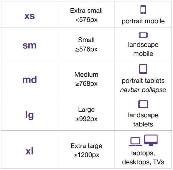
A responsive grid is used. A 12-column grid from the framework Bootstrap 4.5 is used. The design of screens must in principle accommodate desktop views first, then tablets and mobile.
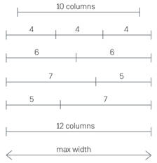
Breakpoints are given by Bootstrap’s responsive grid. If needed, the number of columns in the grid can be expanded. 5 breakpoints are used:
As a starting point, the content of OS2IoT fills with a max-width of 1140px. The last pixels are used for margins so that the contents of the system do not stick to the edge of the screen. As a starting point, Bootstrap uses a fixed pixel value for the width of the content on large screens (1200px).
4.1.2 Screen resolution
OS2IoT is designed as a starting point for the resolution 1280 * 1024 (desktop-first).
Positioning of cursor
Regular position of cursor and existing conventions of using a pointer when elements are clickable and cursor: text when an text can be selected or in text inputs.
4.3 Tab sequence
If no tab index is explicitly defined, the tab sequence on all pages will be from the top left corner to the right and then down.
4.4 The HTML Guide, Bootstrap, and Google Materials
- These points has to be considered before developing further:
Bootstrap is an open source framework consisting of front-end resources. It consists of a collection of tools for creating components and technical behavior on websites and web applications.
In connection with this solution, Materials has been expanded to form the basis of the elements that underlies the HTML guide.
In addition, responsive breakpoints for the solution are defined by Bootstrap’s default values for the same, just as responsive customization is provided by Bootstrap’s codebase.
All webparts must use the HTML guide and must have consistent design patterns and look and feel.
OS2IoT’s HTML guide and especially the prototype must serve as a starting point for the entire user interface and all its elements. Below, use is made of the elements, classes and methods found in the guide.
The templates and design principles developed by Erhvervsstyrelsen must be used in the project.
New templates must conform to these.
The framework includes HTML and SCSS-based design templates for style, forms, buttons, charts, navigation, and other user interface components.
In this project,Materials is used partly as a toolbox for aesthetics and functionality in relation to the aforementioned components, and not least as a base for implementing responsive design. This also means that the only thing that is corrected in relation to Bootstrap’s standard cuddle base is the file containing variables for style, colors, margins, etc.
Page elements
A colour scheme has been provided by OS2 and can be found in the base.scss file at https://github.com/itk-dev/datatidy/blob/develop/assets/scss/base.scss
Modal windows
Except menu and search modals for mobile and tablet views the app will not include modals. The menu and search modals will be full screen size modals sliding up from the bottom of the screen when the corresponding menu item is pushed. The modals will be closable by clicking a close”X” icon on the top right or by pressing the back button of the device.
Links
Bold font, light blue, otherwise like bootstrap convention.
Text
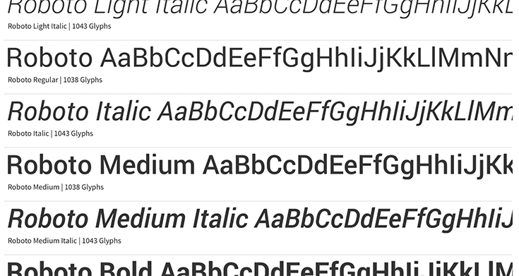
Font for all text in the app is Roboto.
Fonts and typography deal with the selected fonts, as well as formatting and use of text and headings.
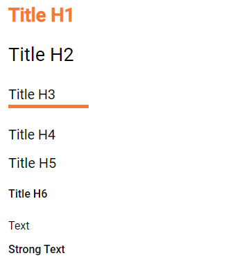
Headings are both a visual tool and a structure in the code that matter to users who use screen readers. It is possible to follow a strict structure in headings for screen readers and at the same time adapt the visual expression of the headings to users who orient themselves visually.
Pictures
Alt text and titles should be provided.
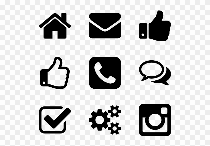
Icons
Fontawesome icons is used
Tables
Materials tables are used and styled
Input fields
Follow the standard bootstrap 4 approach using the color scheme for the project provided by OS2.
Dropdowns
If elements are deletable this will be visible via a vertical “…” button next to it. Clicking or hovering this will show a menu of available options, such as delete, rename or share. When deleting the user should be prompted a dialog informating of the action and/or consequences and if the wish to continue with the action.
Check boxes
Use bootstrap 4 checkboxes and style them as seen below:
Dropdowns, combo-boxes
Use bootstrap 4 dropdowns.
Date fields and use of date pickers
Use bootstrap 4 fields.
Error messages/feedback
Implemented in accordance with Bootstrap https://getbootstrap.com/docs/4.0/components/alerts/
Flow pages
(tab-controls to navigate in the various steps in the flow)
Browser support
Should be compatibale with newest versions of Edge and Chrome dating two versions back. If not, the users can be notified that they need to update their browser.
Encoding
UTF-8 encoding is used.
Best practices
HTML standards
The HTML 5 standards are used. Should comply with Bootstrap and WCAG (for screen reading software).
In general
Use best practices for HTML. Mostly the HTML should be written based on Bootstrap components.
Microdata
There are no search engines or the like to take into account, but screen reading software needs to be able to read the HTML. Using best practices this should ensure sufficient readability.
CSS
Reusability is the keyword. The CSS (SCSS) should be structured in components that are reusable throughout the page.
In general
Use BEM convention for CSS development and naming when possible.
SCSS
Variables
Variables will be kept in a variables.scss file. They should be written with a structure where first you imply what it is and then the variation, like:
$alert-success;

$alert-warning;

$alert-error;

Or:

$blue;

$blue-light;

$blue-dark;
Nesting
Use BEM convention when possible.
Mixins (functions)
Use mixins (end extends) when possible to avoid repetition. Naming convention is the same as for variables.
Inclusion of CSS
The SCSS is compiled to a CSS file that is included the header of the app. This is performed automatically in the process of compiling the Angular application.
JavaScript
In accordance with the Angular best practices TypeScript is used and compiled to JavaScript. The current version of Angular and Typescript is found in the package.json file. This supports the newest browsers in accordance with the agreement with the customer and thus this is used.
In general
The typescript files are locatedin the src folder and compiled to a .js file when building the app. This is situated in the dist folder. Using TypeScript should be done in accordance with the best practices provided in the Angular documentation https://angular.io/docs
Information architecture principles
Better to go deep than wide (customer wishes to minimize clutter and present only the needed information)
Avoid modals when possible and instead present information via depth.
Keep users on a narrow track and make sure they do not stray too much.
There will be no customization options for the app
Content guidelines
Only elements such as titles, select options, links, buttons, input fields, etc are named programmatically. The content is user generated.