User Interface Design
The following section describes the user interface for the OS2IoT solution. How it will look and function, and how the flow between different pages will be.
The project will manage and surveil IoT devices for the users of OS2IoT. The purpose is to make a user friendly user interface where the users can perform the action necessary in connection with setting up, monitoring and managing IoT devices.
The target audience is developers, who are to implement the solution, the customer who has to approve the design and testers, who are to test the solution.
Dependencies
The layouts, and components are developed with the help of Bootstrap 4.5. Please see the documentation on https://getbootstrap.com/docs/4.5/getting-started/introduction/
Page Structure
This describes how the structure of the page is designed.
Page Layouts
A limited list of page layouts will be used. This will ensure that the OS2IoT continuously follows a consistent design and layout, that adheres to the design requirements specified by Erhvervsstyrelsen. The following sections will describe the layouts used on the OS2IoT. The areas on each page template define different areas to which content can be added. Notice that for mobile devices, the areas will be stacked on top of each other, and the ordering of which the area will be stacked is documented in each section.
All layout is aquired with a navigation bar on the left and a Top-menu bar as a easy access to actions required on the page. The background color of the page is set to be #e5e5e5.
Boxed Full Width Layout
 The Boxed Full Width template will use the entire full with of a browsers viewport,
and the content is only boxed in with at .container-fluid class from Bootstrap, which is a width with 100% at all breakpoints.
The Boxed Full Width template will use the entire full with of a browsers viewport,
and the content is only boxed in with at .container-fluid class from Bootstrap, which is a width with 100% at all breakpoints.
<div class="container-fluid">
  <div class="row">
      <div class="col-12">
          <div class="jumbotron">Details Content</div>
      </div>
  </div>
</div>
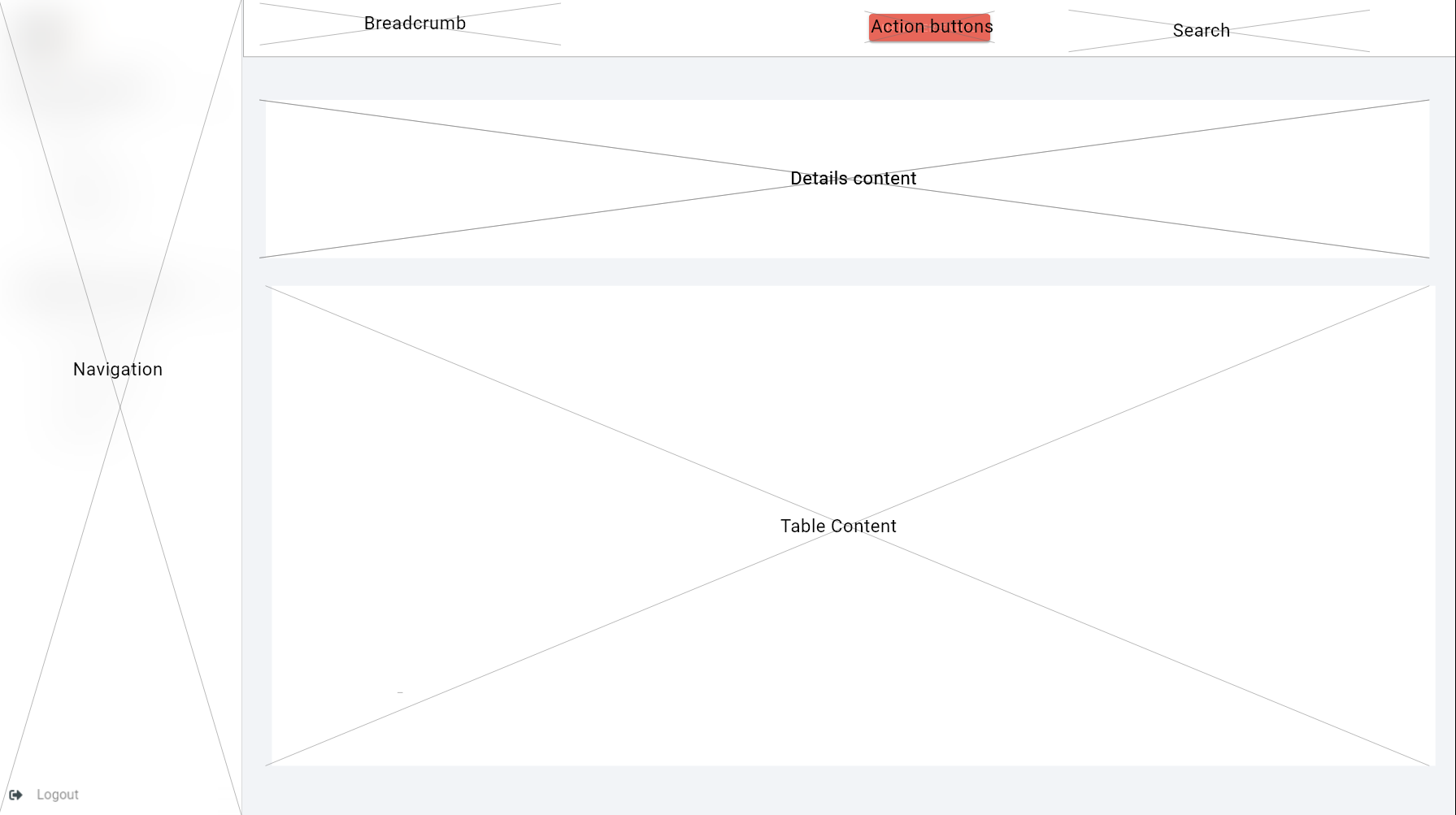
Boxed Feature width Layout
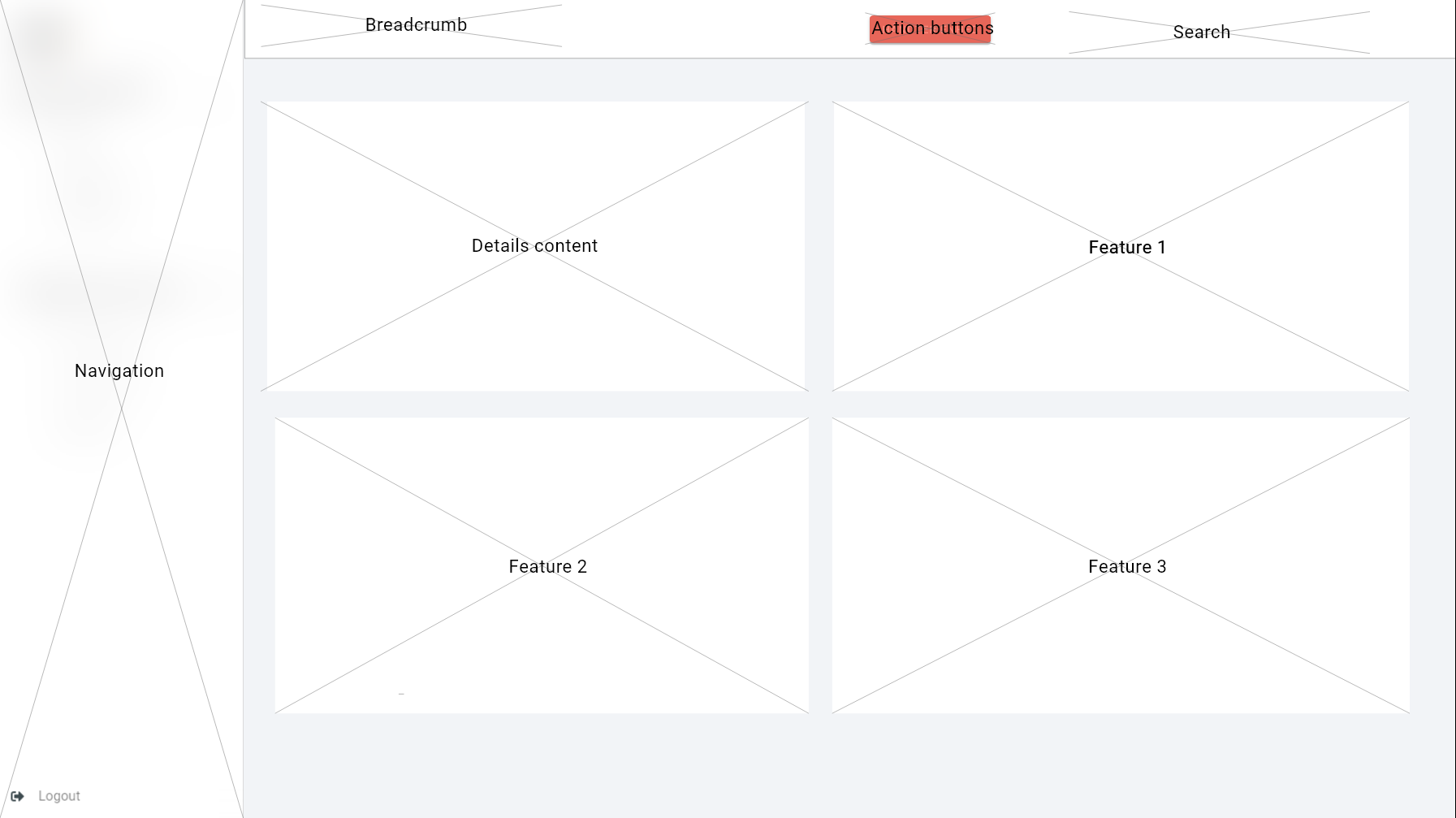
The Boxed Feature Width template is similar to the Boxed Full Width template. This width is contained using the grid system from Bootstrap with extra margins on left and right, dependent on which feature box is developed. Leaving an empty column on each side (marked in grey). On mobile devices the grid will remove the two empty columns on left and right side, allowing the featured areas to utilize the full width of the mobile device.
<div class="container-fluid">
  <div class="row">
      <div class="col-md-6 d-flex align-items-stretch">
          <div class="jumbotron jumbotron--m-right jumbotron--full-width">Details content</div>
      </div>
      <div class="col-md-6 d-flex align-items-stretch">
          <div class="jumbotron jumbotron--m-left jumbotron--full-width">Feature 1</div>
      </div>
</div>
Boxed Form Width Layout
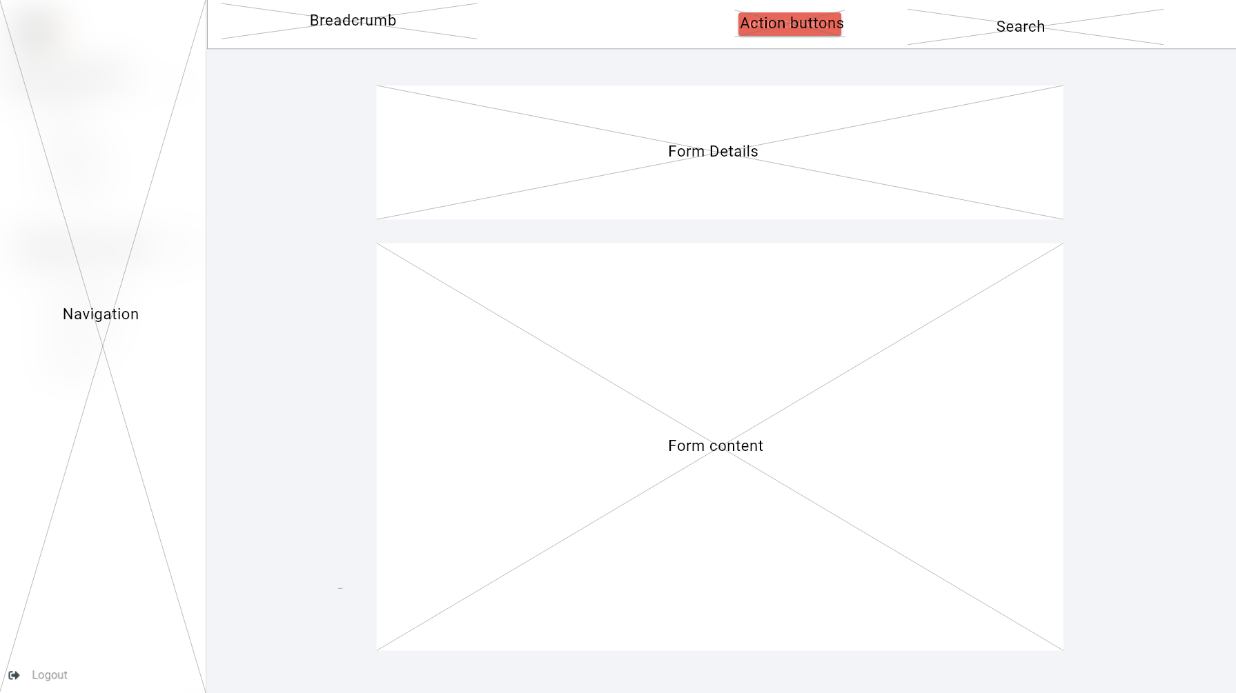 The Boxed Form Width template is similar to the Boxed Full Width template, but has a larger margin on the left and right side.
The Boxed feature width template will be centered with a custom class called “os2-form”
The Boxed Form Width template is similar to the Boxed Full Width template, but has a larger margin on the left and right side.
The Boxed feature width template will be centered with a custom class called “os2-form”
<form class="os2-form p-3 mt-4"></form>
Feature box Layout
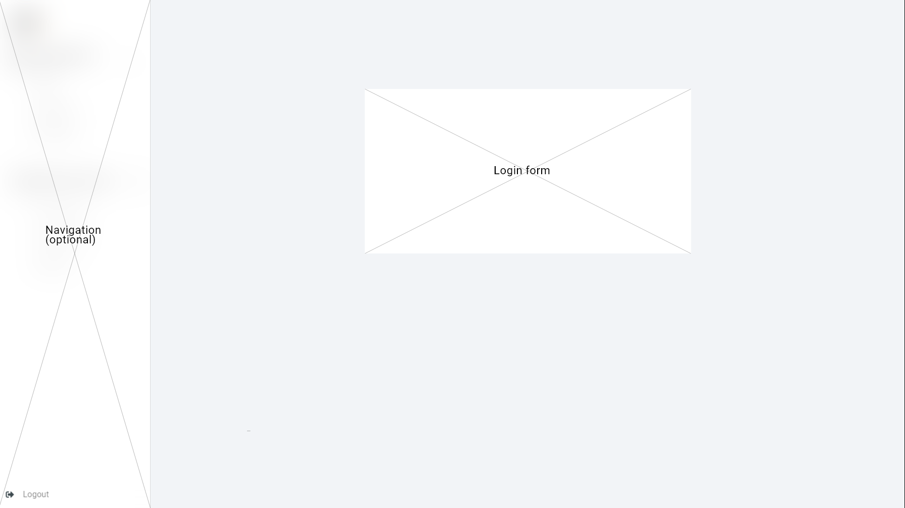 The Feature Box layout template is used to, if needed a stand-alone box on the whole page. Here regular Bootstrap is required.
<div class="row">
    <div class="col-xs-12 col-md-6 offset-md-3 mt-5">
        <form class="p-5 jumbotron"></form> // optional to use form or a div
    </div>
</div>
Mobile / Tablet
The mobil and tablet version is the same except the menu has been placed in a header bar in accordance with the bootstrap best practices. https://getbootstrap.com/docs/4.0/components/navbar/
Page Templates
Every page on the OS2IoT will be based on a page template. Each template will have a defined page layout, and a set of placeholders (areas) to which components can be added. In this section each template used on the customer portal is outlined along with the page layout used.
Template Name |
Page Layout |
|---|---|
Detail Template |
Boxed Feature width Layout |
Form Template |
Boxed Form Width Layout |
Login Template |
Feature box Layout |
Overview Template |
Boxed Full Width Layout |
List Template |
Boxed Full Width Layout |
Global Design
This chapter describes the overall design, navigation principles, and general components of the OS2IoT.
Internationalization (i18n)
Internationalization is the process of preparing for localization. It ensures products and services can be easily translated into local languages and cultures. It’s often shortened to i18n. Ensure that commands, buttons, and forms are easy for each culture to understand.
In OS2IoT we have prepared and applied Internationalization, and setting danish up as the default language, and more languages can be applied.
Navigation
This section describes the User’s navigation options in the System. Here, the navigation options that the User has available are at the left of all the System’s pages via the navigation bar and a graphical overview of the System’s pages is displayed in the form of a sitemap.
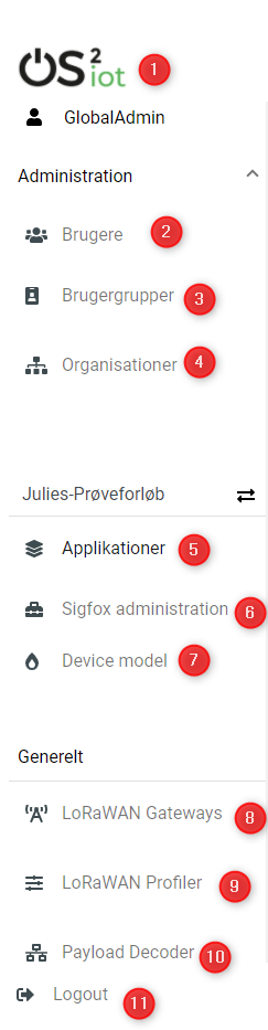
Navigation bar
The navigation bar, which will always be found at the top of all pages in the System, gives the User quick access to the most used overviews in the System. These are shown in the tablet
# |
Specification |
|
|---|---|---|
|
1 |
By pressing “the logo”, the User is navigated to the dashboard |
2 |
By pressing “Users”, the User is navigated to the user overview |
|
3 |
By pressing “Usergroups”, the User is navigated to the usergroup overview |
|
4 |
By pressing “Organizations”, the User is navigated to the organization overview |
|
5 |
By pressing “Applications”, the User is navigated to applications overview |
|
6 |
By pressing “Sigfox Administration”, the User is navigated to a overview of sigfox groups |
|
7 |
By pressing “Device Model”, the User is navigated to the Device model overview |
|
8 |
By pressing “LoRaWan Gateways”, the User is navigated to the Gateways overview |
|
9 |
By pressing “LoRaWan Profiles”, the User is navigated to the overview of device profiles |
|
10 |
By pressing “Payload Decoder”, the User is navigated to the payload decoder overview |
|
11 |
By pressing “Logout”, the User is navigated to the login page |
Sitemap
This section describes the flow between the pages.
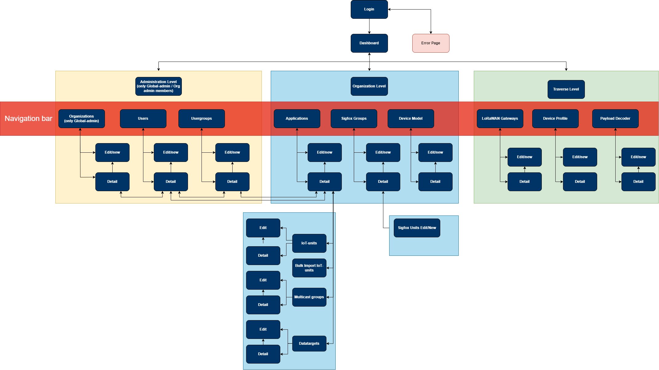
The flow chart above is a simplified view of the structure of the application.
When login in you’ll be welcomed with a dashboard, and you will have accessible features shown in the navigation bar. In short you can navigate forth and back in, and you can access all first level pages at all times through the navigation bar (see the red box)
Futhermore, to get transparency for the user to understand which are transverse or organizational filtered features the navigation menu is divided into three topics in which they each serve an purpose:
Administration level - Is only visible for Global Administrator and User Administrator, and is controls the read and write rights for the members of each application
Organization level - Is where you can add Applications, Sigfox Administration, and Device Models to a certain organization.
Transverse level - is where you can create cross-cutting Gateways, Payload Decoder, and LoRaWan Profiles so all organizations can use these features or add-ons.
From the application you can futhermore add-on datatarget and IoT-devices to the newly created application, thus the sub-box as shown on the sitemap. In order to get transparency on integrating the Sigfox Administration you first have to get the Sigfox group and then the unit, thus the sub-box as shown on the sitemap.
User Rights
It requires a certain right to be able to access certain features with the different admin and read roles.
- Navigation to the system with global-admin functions is done by
adding a whole section for administrative use for global-admin to control the system of user, user groups (permissions), and organizations
adding new organizaions to the system
giving admin rights (delete and edit) to everything inside the organization
activation of another global-admin user
- Navigation to the system with application admin functions is done by
giving admin rights (delete and edit) to applications and Sigfox devices inside the organization
- Navigation to the system with gateway admin functions is done by
giving admin rights (delete and edit) to gateways inside the organization
- Navigation to the system with user admin functions is done by
adding system control of user, user groups (permissions) to the organization pane
giving admin rights (delete and edit) to users and user groups
- Navigation to the system with read functions is done by
giving read rights and cannot delete or edit anything inside the organization
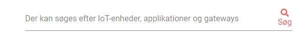
Global Search
The search box is placed in the top right corner in the top bar menu. This is the only search input field in the application. Global search is used to search across entities in OS2IoT, this is done via free text search which is activated from the search icon in the top menu. When searching in global search, the result is not displayed as in other searches, since in global search, several entities can be searched at the same time. The result is displayed instead on a single page where both the data type and selected data for this data type are displayed. The following entities are searchable via global search:
Applications
IoT-devices
Gateways
Indexed fields for free text search
To minimize irrelevant search results, not all fields are indexed to the global search.
For example, it will i.a. be possible to seek a application on the basis of the application name, or application id,
but not on e.g. the creation date, as searches on dates would otherwise yield too many irrelevant results.
The picture below shows how the search result is presented.
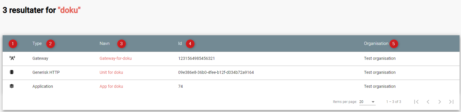
showing which icon the search has broad, separated into applications, units, and gateways,
which type divided into Applications, Generic Http, Lorawan, Sigfox, and Gateways,
showing the name,
showing the id,
showing which organization the item belongs to.
Help
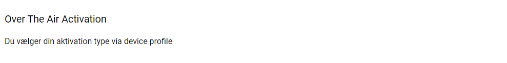
Info boxes
Info boxes provides information about the use of a particular feature. These can be shown in to different ways:
Whereas the blue box highlights the information,
and the other one is more discrete in its expression.
Orientation
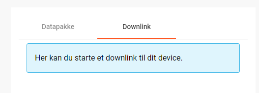
Orientations are intended to draw the user’s attention, and to communicate information. The OS2IoT will display the User a modal which is provided by google materials.
Validations
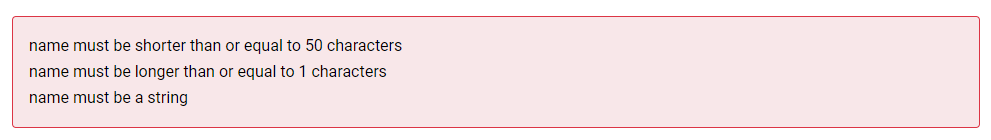
Validations are handled on the server side. When data is stored on the server side, validation of the User’s entries is performed for each field, and together for the form. If the server side, after validating the User’s entries, finds that the entry does not comply with the validation rules that have been set, the User will be informed that the entry is not valid.
Field Validation
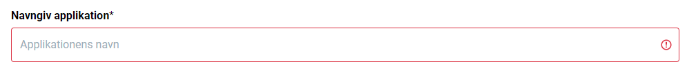
When the user leaves a field that does not meet the set validation rules, the field for the user is marked in red and a message is displayed for the User, with the criterion not met.
Validation of user actions
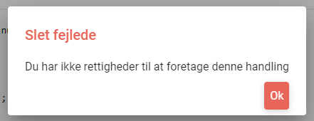
When the User performs an action, eg by submitting a form by pressing the Save button, the user’s action is validated by the server side before it is performed. The User’s action is validated overall and any validation errors are presented to the User in an overall overview, presented in a red box above the form.
Error messages
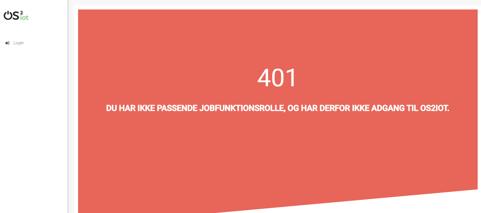
Error messages occur in various ways such as an error page.
When an error occurs in the OS2IoT that prevents the User from continuing his work, the OS2IoT will display the User a page with an error message or alert.
Edit / delete
Handled server side. An api is called when saving, editing or deleting items.
Tab order & Shortcuts
The tab order will be from top to bottom and left to right in a columnal fashion for all interactive elements . See the below image for further details.
Shortcuts has been disregarded for now
Security
The user interface is developed responsively according to the rights (user system roles) and data boundaries the user is assigned in usergroups. A description of user system roles and data delimitations can be found in User Rights, as well as a description of what each user system role provides access to in the system. In addition, some suggested job function roles (groups of user system roles from Kombit Adgansstyring). In general, the user interface acts in three ways, to enforce the user’s rights in OS2IoT, these are to hide action buttons for the user, mask data on lists and deny access to parts of the solution.
Hide components and buttons
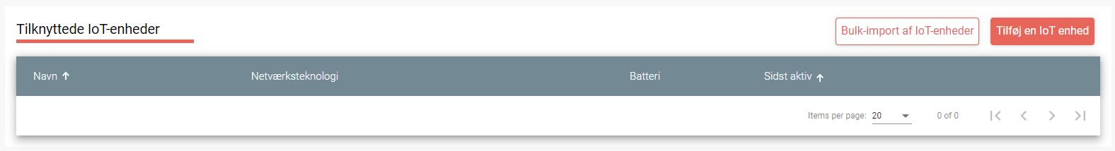
Action Buttons in tables and list on overview pages are hidden if the user does not have rights to use / view them.
User with read rights.
User with write rights
Access denied
If the user actively changes the URL to access a applications, details pages or anything else he may not have access to,
according to his user system roles and associated data boundaries, he will be redirected to an empty page with HTTP error response in the header.
